When I was very, very little, I had a “driving simulator” that was made by Tomy… what a quick Google tells me is the Turnin’ Turbo Dashboard. I use quotation marks because well, it wasn’t a simulator as there were no microchips involved.

This plastic (but non-microchip based) toy kept me enthralled for hours on end. It projected an image of a small red car driving along a road using endearingly antiquated motors to turn around a stencil which projected these images onto the screen, and made a “car” noise. I loved this toy until it broke down but at the age of 4 I was kind of big for it anyway and the Sega Master System beckoned (which was microchip based and began my fascination with technology). Why am I telling you this, though? It’s because I’ve come to the realization that computing has now caught up to that toy. We are now living through the age of what I call Fisher Price Syndrome, where vritual squeaky buttons and light shows are drowning out simple usability.
Microsoft has just released an abominably bad operating system: Windows 8. Why is it abominably bad? Well, ever since Microsoft Windows 95 we’ve had the Start Menu, which in itself was a revolution when most computers up until then had to launch a GUI via an MS-DOS command line. Computers were either specialized word processors that were basically glorified typewriters, or were “for geeks” and ownership of such things was the route to being a social outcast shunned by all and whose only social outlet was trying to find other similarly geeky people (which in those days where the internet was confined to universities and expensive dial up connections) to share the love of computers with. Windows 95 made things nice and easy for people, and the world finally “got” the internet.
The Windows 95 desktop metaphor was hugely influential, and has been a staple of Windows operating systems until Windows 8. Out went the Start Menu, to be replaced with the Start Screen:
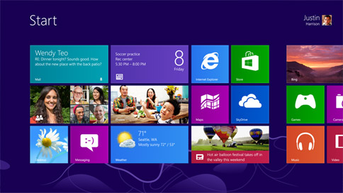
Now, if this was purely for tablets, I’d say “so what”, but no – it’s for all computers, whether tablet or keyboard and mouse… and if it’s for keyboard and mouse, I say “yuck” and “fuck no”. Tablets are computers that are a) easily usable for reading books and casually browsing the internet and b) for those who found Windows 95 and every iteration after it still too much. Now you just touch buttons, and things are installed easily and painlessly. It works very well on smartphones, and as a Google Nexus owner I find that the touch interface is great in replacing the old physical buttons. I tolerate the big, bouncy icons because they’re meant to make it appealing to all, and the touch interface works wonderfully well. However, I draw the line at mobile phones for the “touch” interface because when it comes to computers, well… it sucks.
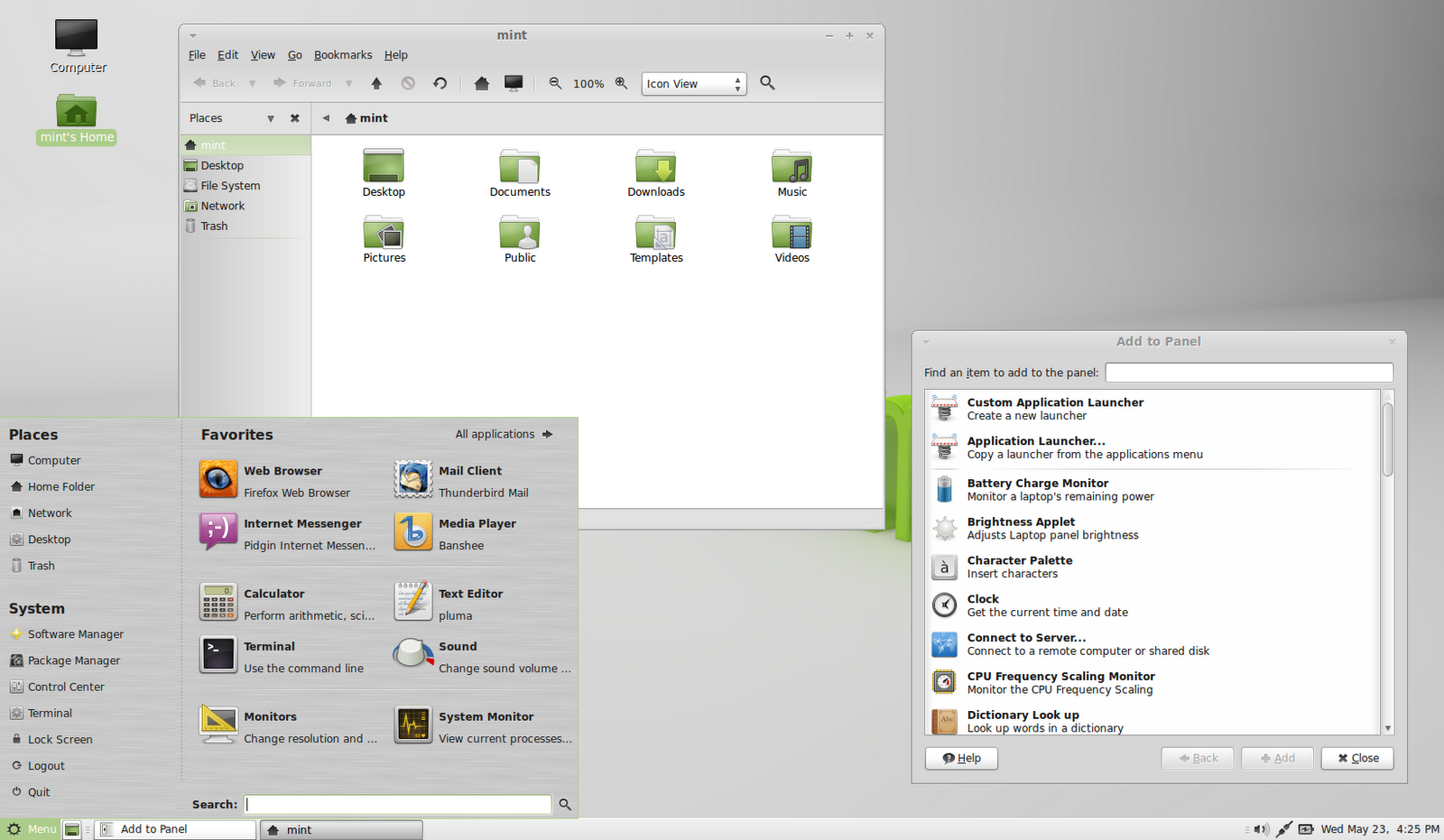
Big, bouncy icons and flashy graphical effects are starting to become the bane of my life when it comes to the desktop. I expected Microsoft to do it, but when Ubuntu et al. started to do it I wondered if perhaps I was old fashioned or something… but it turns out my fears were justified. You see, before I run a Linux operating system I subject it to what I call “the virtual machine test” and run it on my faithful Windows 7 box (which uses the Start menu and is the successor to Windows XP’s Best Windows Ever crown) in VirtualBox to see if it’s usable. My reasoning goes that if it can run well on what is equivalent to a pretty crappy computer, once I give it a computer of its own it should run very well. So far, the only one that’s passed the test have been Linux Mint 14 with the MATE desktop and Fedora 18 with XFCE. Out of personal preference, I’ve gone for Linux Mint 14 because it’s based on the Ubuntu codebase and Unity aside, I generally prefer the Ubuntu way of doing things (which itself comes from Debian).
Other than that… GNOME 3 and Unity have proven woeful at running on my virtual PCs, so why should I run them on a real machine instead? What I’ve always valued is a fast, responsive machine that does what I want when I want it to. I don’t want to have to sit back for LLVMpipe to go and render a “beautiful” swooshing window effect as I move it about because even if it’s just a small amount of computing time, it’s being taken away from doing something else that I want like compiling software, or if I’m relaxing just playing a Youtube video or Spotify. Or indeed, if I’m playing Spotify while working on something – I’d prefer that my memory and CPU resources be used usefully, rather than making pretty effects which I really don’t care for.
Perhaps I’m just a dinosaur, or I’m just a massively pedantic geek (probably the latter), but I find the whole movement towards “beautiful” desktops incessantly annoying. These “advances” come at the price of usability, at least as far as I’ve experienced. Whenever I see Linux vs. Windows arguments, one usually goes something like “Windows is full of bloatware that eats up memory, whereas Linux is so much more faster”… although not any more, it seems. Now we have Unity and GNOME 3, which both appear to be trying to compete with Windows on “beauty” rather than usability. I’ve seen Unity run well on a friend’s machine before, mind you, so I know I could install it on a machine and it would most likely run well… but still, there’s the question of why I’d want to do so when there’s better alternatives to Unity and GNOME 3 out there.
I use Red Hat Enterprise professionally, and Red Hat appear to have the same philosophy. People using it in the workplace don’t want whooshing effects every time they look for applications, or a mini fireworks display when logging in – they just want it to work, and so they’ve stuck to GNOME 2 which on a well-resourced machine is fast, useful and gets the job done quickly. That’s why I’ve actually come to like the MATE desktop – it basically is GNOME 2, but forked so that development on it can be continued when the GNOME Foundation has gone off in search of “beauty”. And it’s not as if MATE can’t do anything the other can either – the whole “you now search for apps rather than find them in a menu” thing is there in Mint 14 when you press “Menu” down the bottom… as well as having the traditional Start Menu-style interface. And the menu just appears, no swooshy transparent effect or any other CPU-wasting nonsense – to quote Apple, it just works.
I’ve tried LXDE, but I found it to be quite flaky, and I did use XFCE for a while until the laptop I had Xubuntu on died. I’ve now got an old desktop machine (well, Intel Core 2 Duo, not too old) that I’m planning to install Linux on, and I think Linux Mint and MATE will be a fine partner for it. I’m not ruling out that I might try Ubuntu’s Unity or GNOME 3 as I am kind of curious about how they work after moving away from the traditional “desktop metaphor”… but I think for day to day use I’d rather have a reliable desktop OS than something which uses a hefty chunk of CPU time trying to replicate something I used to play with 25 years ago…
