(This is heavy on JPEGs. There will be some awesome JPEGs, but still heavy on JPEGs nonetheless. Just a heads-up.)
As it’s coming up to blockbuster season again, we’ll be seeing a lot of big films out over the next few weeks. Big films aren’t just about the film only, though, increasingly they’re forming part of a whole entertainment experience. Leaks of spoilers, trailers, tie-in viral stuff… the blockbuster is no longer just “a film” on its own. The studios are coming up with more and more elaborate ways to market their stuff, but to my mind they’ve left something very important slip by the wayside: the movie poster. It’s really a shame that it’s been overlooked, because for me the movie poster is one of the things that really makes (or made) the cinema going experience. You go in, you go up the escalator or walk towards the box office and as you go there your attention is drawn towards adverts for coming attractions, attempting to get you to think “ooh, that doesn’t look too bad”.
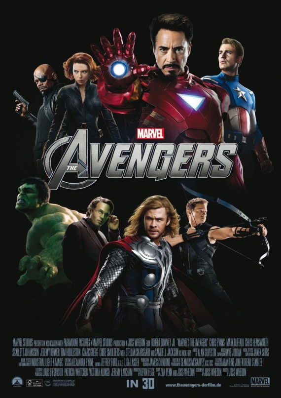
Why do I think the movie poster has been given a bum deal in this day and age? Well, increasingly it’s now become the realm of Adobe Photoshop which at least to me is a crying shame. Take a look at the international poster for The Avengers (I flat-out refuse to call it the rubbish UK name Avengers Assemble, which sounds like a kid’s TV series):
I find it kind of… underwhelming for such a big production. It looks like it’s been whipped up in Photoshop in five minutes by someone, and it’s all reused art from other posters. There’s no real craftsmanship or anything, just a poster featuring some movie stars and the title and that doesn’t really sell me on the film. If I didn’t have the trailers and the set reports and everything else, if I was just learning that they were making a film of The Avengers from this poster I can’t say I’d be particularly excited for this film. The other poster does a bit of a better job:
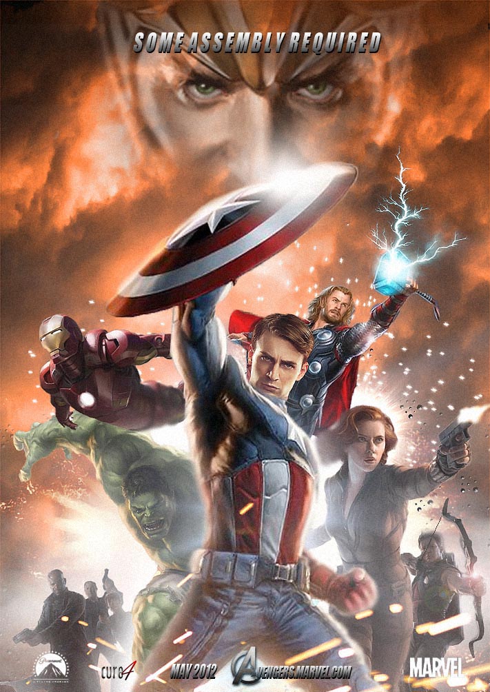
with some stuff going on in the background, but for me there’s still something missing. They don’t really capture my imagination, and to be honest I think it would’ve been better if they’d just contracted some of the fans to do the poster, because just a quick image search shows up efforts far superior to the “official” version:
or this one:
and this one:
Three examples of fan art that is superior to the one that Marvel Studios came up with. If I’d seen these up in the cinema when I last visited, I think I probably would have looked and thought “awesome”, instead of “meh”. I think out of all of these fan designs, the second is my favourite (designed by Cure4, a cursory glimpse of his deviantArt gallery reveals other creations superior to the “official” version) as for me it’s really evocative of a lost era of the design of movie posters, when they employed artists to draw a poster for a film rather than just photoshopping together publicity shots. Of course the fan poster is Photoshop too (I think) but the designer has put a little more thought into the way it’s put together. All three sort of evoke the feeling that The Avengers are a group of super-powered people coming together to face a grave threat to the future of humanity and imbue it with a certain sense of excitement, rather than just showing a few people posing in a messy New York street.
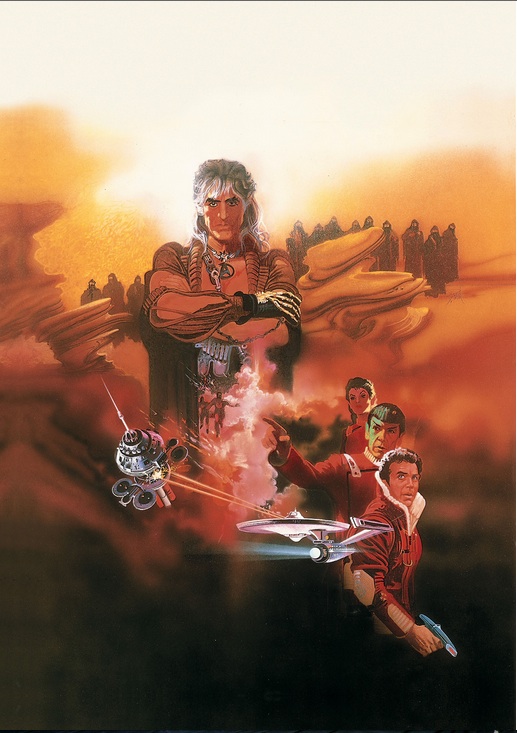
There’s an idea that films of the 1980s had something that modern films lack. JJ Abrams appears to be most definitely of this mindset as for Star Trek he said he was trying to evoke the feeling of 1982’s The Wrath of Khan and Super 8 is an out-and-out love letter to the Spielberg blockbusters of the 1980s where ordinary people found themselves having the extraordinary pushed into their lives. Part of the reason, I think, is that these films were the first “modern” blockbusters where they existed in the form that we know them as today: CGI was just appearing, and it was becoming possible to insert special effects in a slicker and more believable manner. We’d been amazed by Ray Harryhausen’s monsters, and numerous costume effects, but Star Wars and its ilk really took it up a notch, pioneered the effects driven flick and today’s are imitating them in a slicker manner and the excitement has gone a bit from SFX overload. But I’d argue that part of that lost magic was the movie poster. Take a look at the poster art for the aforementioned Wrath of Khan:
I’ve always loved this poster, as for me it epitomizes that film perfectly. It tells me that this is going to be a story about the relationship of Kirk and Spock, and also a struggle against Khan who’s survived on the deserts of Ceti Alpha V and is now out for vengeance. The fact that it’s drawn, rather than photographed, allows the artist to try and draw together all of the elements and emotions within the story and try and express them to the potential viewer without giving too much away. This poster succeeds on every level for me, and it’s far superior to today’s cut-and-paste-on-a-Mac movie poster design as beautiful hand-drawn art manages to truly capture the drama and emotion of the film and give those who see the poster a sense of the movie’s soul, so to speak. I’m not quite sure who drew this one, to be quite frank, but it’s good.
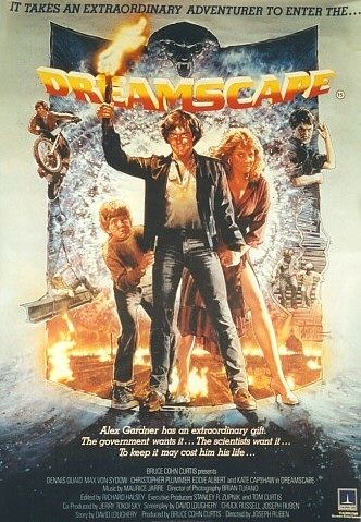
However, no-one epitomizes the classic 1980s movie poster more than Drew Struzan, the artist who designed the posters for many of the 1980’s classic films. His artwork is actually the best part of some really shitty films such as the rather forgettable 1980s “warring psychics” film Dreamscape:
I can’t find many better versions of it sadly, but the Struzan poster actually makes the film look a damn sight more exciting than it actually is. It actually amounts to a hilarious scene of Dennis Quaid wrestling with a rubber snake man being the only worthwhile thing in it, but the Struzan poster evokes the promise of action and adventure and positively demands I see it, even if afterwards I’m going to be walking out of the cinema thinking “boy, that sucked monkey balls”. As it so happens, it was merely put off by my mother as a kid and later rewatched by me on Netflix leaving a vague sense of relief at not having spent money on it…
If Struzan can improve the appeal of a shitty film, he can create epic imagery for classics such as Blade Runner that just make you think you’ve got to see them:
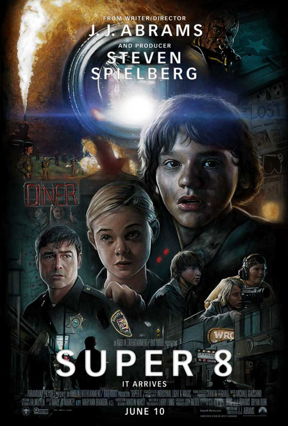
It evokes the noir atmosphere of Blade Runner, and you can see that Struzan put a lot of thought into the makeup of the poster and the emotions he was trying to evoke in those that would see it. Rather than just five minutes, the man’s put a lot of effort into the poster and you can really feel it and in turn it makes you actually give a shit about the film and if it were coming out would give me a real sense of anticipation. You can see why Paramount decided to create a Struzan-style poster for Super 8:
I fell in love with this when I first saw it. I enjoyed viewing it when I saw it on the net, and when it popped up in the Vue cinema in Swansea I spent a good five minutes looking at it and trying to see all the detail in the image. It was unique in an era of Photoshop where craftsmanship of the movie poster is becoming a rarity. There are many things I love about Super 8 (good cinematography, story, sound design… I could go on) and this is one of the best things about it – its promotional team really made an effort. Sadly, it’s all too rare these days, and I hope it will return someday when Hollywood finally decides to start giving a shit again rather than just trying to find ways to squeeze money out of people for as little effort as possible. In fact, here’s a suggestion for Marvel Studios: when you do Avengers 2, give the gig to Cure4, the man behind this awesome poster for Thor:
because let me tell you, anything by him kicks the ass of some of the five minute photoshop-jockeys that seem to inhabit the studios’ promotional departments today. Whoever you are, sir, I take my hat off to you – if I’d seen this hanging in the corridors of Brighton Odeon a few months before Thor came out I’d have been there on the opening night, rather than just sloping through the doors a week after it had opened…





the poster of the wrath of khan is designed by robert peak, great painter who did also apocaypse now and superman the movie…
Thanks for that! I’ll have to check out some of his work as well…
i am a huge fan of drew too, he was like a master for me 😉 if you like movie poster before photoshop check out renato casaro, richard amsel and jean mascii … now we are talking “movie poster “!